What is a bar chart?
A bar chart is a graphical representation that shows the relative sizes or frequencies of different categories or values.

A bar chart is a graphical representation that shows the relative sizes or frequencies of different categories or values.

A bar chart is a graphical representation that uses rectangular bars to show the relative sizes or frequencies of different categories or values. The length or height of each bar is proportional to the value it represents. Bar charts are commonly used to display and compare categorical or numerical data, such as sales figures, survey results, or demographic data.
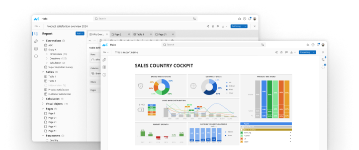
In the example below, each bar shows the percentage of people by country who agree with the statement that price is more important than brand name.

To create a bar chart, you will need to have data that can be grouped into categories. Once you have your data, you can follow these steps:
To read a bar chart, start by looking at the height of each bar. The height of the bar represents the frequency of the data point. For example, if the bar for "Male" is taller than the bar for "Female", then there are more male data points than female data points.
You can also compare the heights of the bars to see how different the frequencies of the data points are. For example, if the bar for "Male" is twice as tall as the bar for "Female", then there are twice as many male data points as female data points.
Bar charts are a good way to compare different sets of data. They are also a good way to show the frequency of data points. Bar charts can be used to display both categorical and numerical data. For categorical data, the bars can represent the frequency or count of each category, while for numerical data, the bars can represent the actual value of the data.
Bar charts can be customized in many ways, including the color and thickness of the bars, the style and color of the axis lines and labels, and the inclusion of additional features such as data labels or error bars. They are a versatile and effective tool for visualizing data and communicating insights to others.
Here are a few tips for creating effective bar charts:
There are several types of bar charts that can be used to represent different types of data. Here are some of the most common types:
Clustered bar chart: This is the most basic type of bar chart, where each category is represented by a vertical bar and multiple bars are clustered together for each category. This is useful for comparing data across different categories.
Bar charts can also be grouped or sorted in different ways to highlight patterns or trends in the data. Choosing the right type of bar chart depends on the type of data and the insights that need to be communicated.
Try all the bar charts you can easily create with mTab.
Make smarter decisions faster with the world's #1 Insight Management System.
